


ioX-Pulse 1.141.0 opens Analytics (Beta): you can now ask questions of your sensor history across many devices at once, save the answer as a visualization, and put it on any dashboard next to your live tiles. Analytics is a beta feature and a plan feature, and it is off until your plan turns it on. This post covers what shipped, what each change lets you do, and where to find it.
Dashboards show you now. Analytics shows you the pattern.
Your ioX-Pulse dashboards answer "what is happening right now": live readings, gauges, alerts, and short time ranges of up to 30 days. That is the right view when you are watching a freezer or a pump today.
It is the wrong view for a different set of questions. Which of your sites runs hottest. What your water use looks like by hour of the day. Whether signal quality on one network has drifted over the last 90 days. Those questions need readings aggregated across many devices over weeks or months, grouped and compared.
That is what Analytics (Beta) does. You build a visualization, save it to your library, and, if it is useful every day, place it on a dashboard as a tile so the historical view and the live view share one screen.
What shipped in 1.141.0
Analytics (Beta): build a chart, save it, reuse it
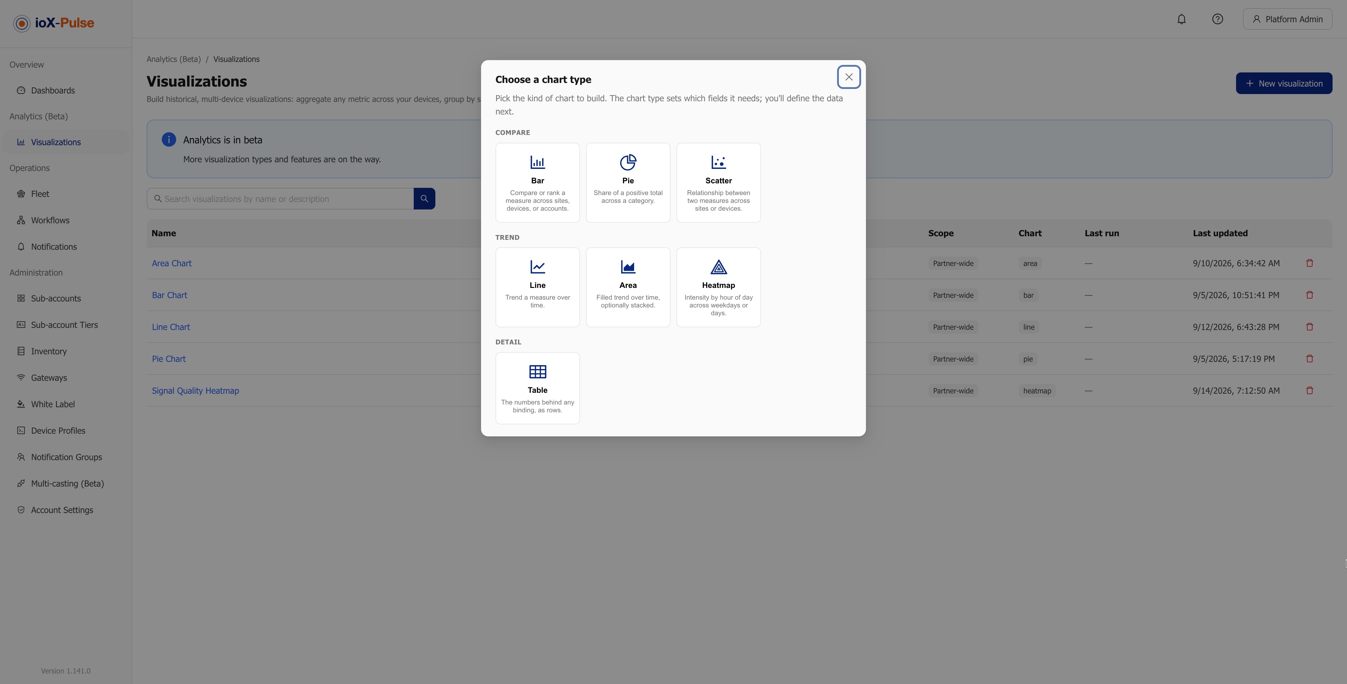
You pick a chart type first, because the type decides what the editor asks you for. The types available are Bar, Pie, Scatter, Line, Area, Heatmap and Table:
- Bar: compare or rank a measure across sites or devices.
- Pie: the share of a positive total across a category.
- Scatter: the relationship between two measures, one point per site or device.
- Line and Area: a trend over time, optionally one series per site or device.
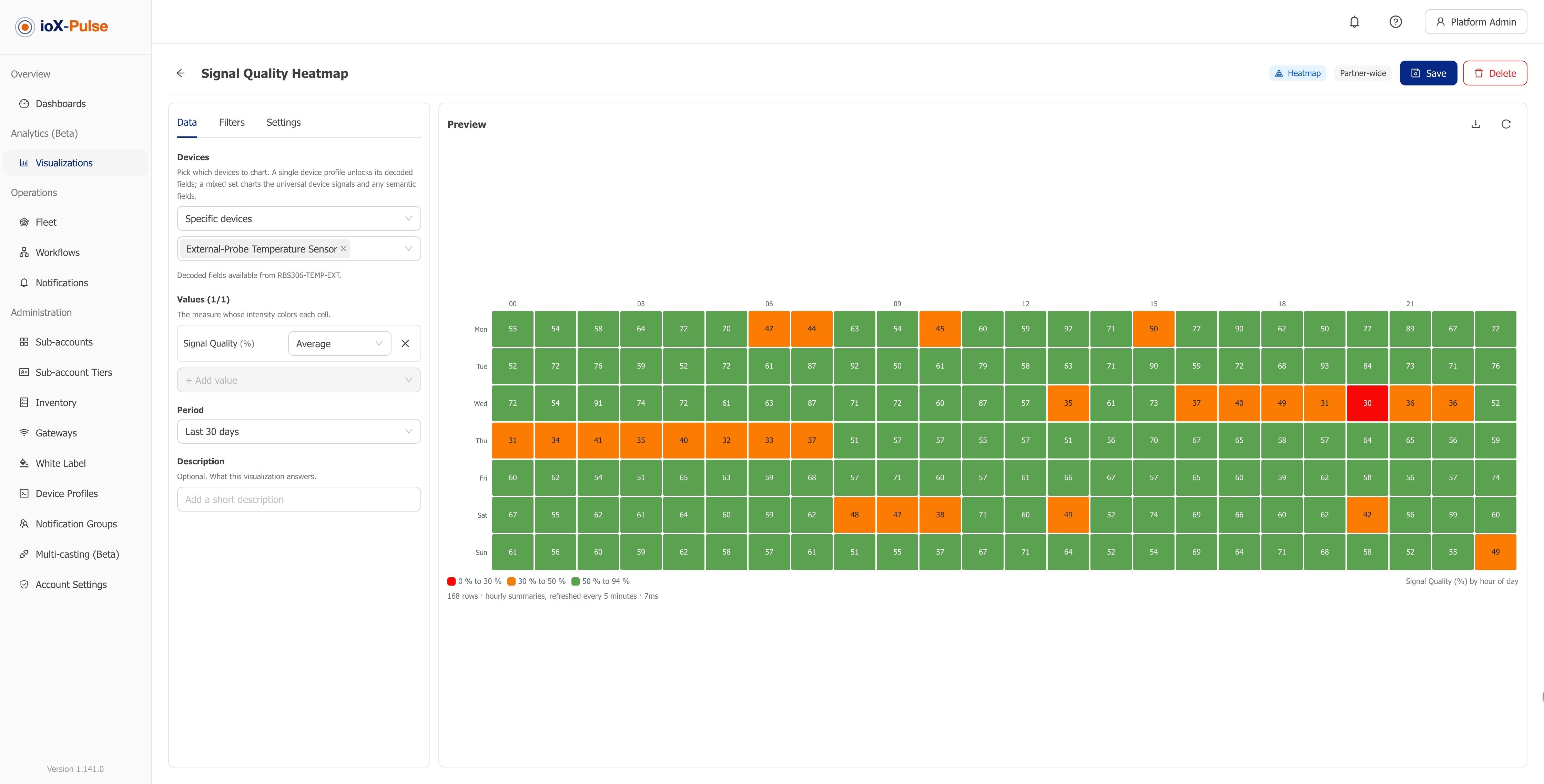
- Heatmap: intensity by hour of day across weekdays or days.
- Table: the numbers behind any binding, as rows.
Then you choose the devices that feed it: all devices, one device profile, a site, a network, or specific devices. When every selected device shares one profile, that profile's own readings become available as values. A mixed selection charts the universal signals every device reports, which are signal strength, signal-to-noise, signal quality and gateways per reading, plus any semantic fields your profiles have tagged.
You choose how to summarize each value too: average, minimum, maximum, sum, count, latest, or change, which is last minus first and is what you want for meters that count up.
Group by hour of day or day of week
Any grouped chart can bucket readings by the hour or the weekday. This is what the Heatmap type is built on, and it is how you find the shift, the hour or the weekday where something goes wrong. Buckets follow each viewer's own time zone, the one set in their profile or otherwise the browser's, and the caption under every chart names the zone it used. Two people in different time zones see the same readings grouped by their own local hours.
Formula and mapping fields are chartable
A device profile's formula fields and numeric mapping fields can now be charted, filtered and downloaded like any other reading, over any period and at any grain. Values everywhere in Analytics follow the decimals you set on the field, so a chart does not disagree with the tile beside it.
Download the rows behind a chart
A download icon in Analytics and on every visualization tile hands you the rows on screen as a CSV file, at the level you have drilled to. Authors can turn the download off per visualization. A chart that would return too many rows is refused before it runs, with the size and what to change, instead of quietly returning a truncated answer.
Put a visualization on a dashboard
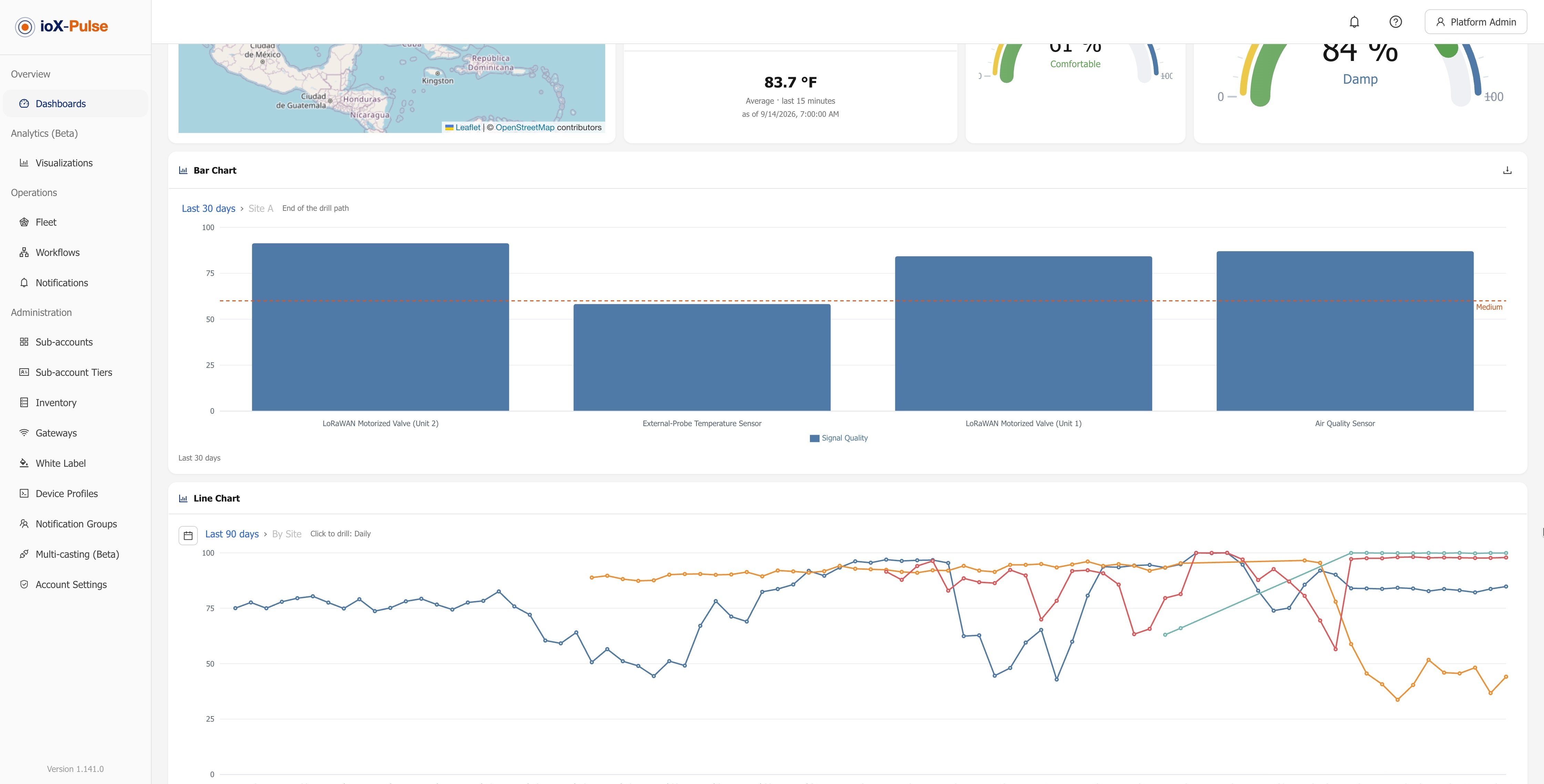
Any saved visualization can be placed on a dashboard with + Add visualization in edit mode. Tiles refresh on a schedule and you drill into them in place. Embedding never crosses accounts: fleet and partner dashboards take partner-level visualizations, and a sub-account dashboard takes only that sub-account's own, even when a Partner Administrator is doing the editing. Visualization tiles are left out of public dashboard links.
Computed values are stored with each reading
This is the quiet change that matters most. Formula fields, mapping fields and per-device calibrations are now computed when a reading arrives and kept with it. Tiles, charts, downloads, workflows, integrations and Analytics therefore show one number, and history stays as it was rather than shifting under you when someone edits a formula. Existing values were filled in automatically.
Controls come with it. When you save a formula, a mapping or a calibration, Apply from asks how far back the change reaches: now, a date, or the earliest reading kept. And Recompute history rebuilds a profile's computed values over a range, filling gaps or replacing them, with progress and a run list on the Fields tab. If a formula or mapping could not be computed for a reading, the device's Events tab names the field and the reason.
Semantic fields
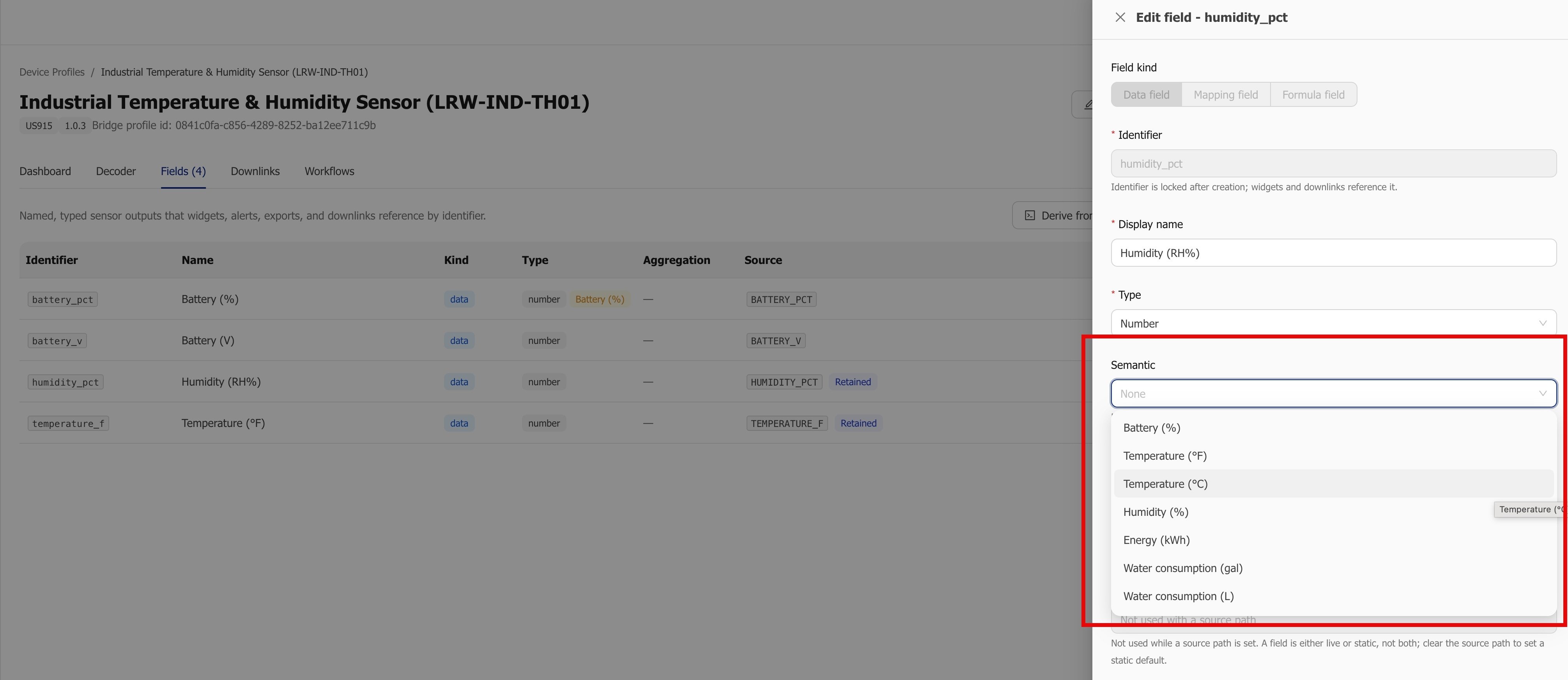
You can mark one field per device profile as a common kind of reading, such as Temperature (°F) or Humidity (%). Analytics, the Count widget and whole-account workflows then read that kind from every device profile, so one chart or one alert can cover devices from different manufacturers without you rebuilding it per profile.
Computed values in your integrations
Webhook readings, the live feed and the API now carry a derived block beside the raw data, holding the profile's computed and calibrated values. Your own system receives the same number your dashboard shows, without reimplementing the formula on your side.
Smaller items in this release: readings, events, downlink and command history, certifications, calibrations and gateway stats are deleted when hardware moves back to inventory, so the next customer starts clean; inventory hardware still appears in API lists with its status, but its live values are empty and reading from it or sending to it answers 404; and inventory hardware is no longer offered in dashboard widgets, Analytics, workflows, multicast groups or webhook filters.
How far back Analytics can look
Analytics keeps history at several levels of detail and reads whichever one fits the question you asked:
| Level | Kept for | What it answers |
|---|---|---|
| Readings | Your tier's raw retention | Filters, short windows, and hourly detail over windows of up to two days |
| Hourly summaries | Your tier's hourly aggregate retention, 365 days by default | Hourly detail beyond two days, and daily, weekly or monthly charts over windows of up to 60 days |
| Daily summaries | 10 years | Daily, weekly and monthly charts over longer windows, and headline figures over long periods |
Summaries are built every hour for every account whether or not Analytics is switched on. An account that turns Analytics on later finds its history already waiting. Two things to set expectations by: filters read individual readings, so a filtered chart cannot reach further back than your raw retention, and the editor tells you so; and daily summaries are UTC days, so a daily chart over a window longer than 60 days is drawn on UTC days and the caption says so.
Turning it on
Analytics (Beta) is off by default and appears only when your plan includes it. If you do not see Analytics (Beta) in the sidebar, your plan does not include it yet.
If you run ioX-Pulse as a platform for your own customers, it resolves at the partner tier and at the customer tier, and both must be on: your partner tier, which ioX-Connect sets, and each sub-account's customer tier, where you switch Pulse Analytics on under that tier's Features. The same tier editor carries Max visualizations per scope, which caps how many saved visualizations a scope can hold; leave it at 0 for no limit. Changing either needs the Partner Administrator permission.
Within an account, anyone whose role can see the Analytics section can open the library and run visualizations. Building, editing and deleting needs the Manage analytics permission. Administrators have it by default, and an administrator can grant it to an Operator or a Viewer under Account settings, Role permissions.
Where to go next
- See what the dashboards do today on the ioX-Pulse dashboards page.
- Check which plan you are on, and what each one includes, on ioX-Pulse pricing.
- Not running ioX-Pulse yet? Talk to an IoT Specialist and we will show you Analytics against your own kind of data.
Frequently asked questions
What is Analytics (Beta) in ioX-Pulse?
It is the module for historical, multi-device analysis. You build a visualization that aggregates readings across many devices over days, weeks or months, save it to a library, and place it on a dashboard as a tile. It is a beta feature and a plan feature, and it is off by default.
How is Analytics different from a dashboard?
Dashboards show what is happening now: live readings, gauges, alerts and time ranges of up to 30 days. Analytics looks back, aggregating readings across devices over longer periods and letting you group and compare them. A saved visualization can then sit on a dashboard beside the live tiles.
Which chart types can I build?
Bar, Pie, Scatter, Line, Area, Heatmap and Table. The type you pick decides what the editor asks for: whether it groups by a category, whether it has a time axis, and how many values it takes.
How far back can an ioX-Pulse chart look?
Individual readings are kept for your tier's raw retention. Hourly summaries are kept for your tier's hourly aggregate retention, which is 365 days by default. Daily summaries are kept for 10 years. A chart reads whichever level fits the question, and when a period reaches further back than a level keeps, the chart uses what is retained and notes the earliest date it could use.
Can I export the data behind a chart?
Yes. A download icon in Analytics and on every visualization tile gives you the rows on screen as a CSV file, at the level you have drilled to. The author of a visualization can turn the download off for that visualization.
What changed about formula fields and calibrations in 1.141.0?
They are now computed when a reading arrives and stored with it, instead of being recalculated on each view. Tiles, charts, downloads, workflows, integrations and Analytics all show the same number, and earlier history stays as it was. Saving a formula, mapping or calibration asks how far back it applies, and Recompute history rebuilds a profile's computed values over a range.
What is a semantic field?
A field on a device profile marked as a common kind of reading, such as Temperature (°F) or Humidity (%). Analytics, the Count widget and whole-account workflows read that kind from every device profile, so one chart or alert covers devices from different manufacturers.
Is Analytics included in every ioX-Pulse plan?
No. It is a plan feature. If you do not see Analytics (Beta) in the sidebar, your plan does not include it. The ioX-Pulse pricing page shows what each plan includes.
Want to see Analytics (Beta) against your own readings? Talk to an IoT Specialist.
Topics from this blog: Platform Updates IoT Platfrom ioX-Pulse Changelog